Part of Warehouse Visibility Series
Heat maps — a simple way to see warehouse activity
Wouldn't it be helpful to see your warehouse activity, instead of trying to understand it from rows and columns of data? A heat map turns the data your WMS already has into a picture you can act on.
Why a picture beats a report
Wouldn't it be helpful to see your warehouse activity, instead of trying to understand it from rows and columns of data?
Your warehouse systems already contain valuable information about inventory, locations, picks, empty bins, and slow-moving products. The problem is that this information is buried in reports and spreadsheets. A heat map turns that data into a visual picture that is much easier to understand.
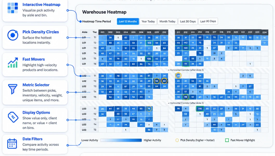
With the Warehouse Heatmap tool you can view a floor plan of your warehouse, with each location color-coded by activity, usage, or inventory status. With one look you can see which areas are being used heavily, which areas are underused, and which locations need attention.
A warehouse heat map is like a data-driven "paint by numbers" view of your facility. It takes the warehouse information you already pay for and places it directly on top of your warehouse layout. Instead of only looking at numbers, you can see patterns across the building.
What a heat map can show you
The Warehouse Heatmap tool surfaces:
- Empty bin locations
- Fast-moving pick areas
- Slow-moving inventory
- High-activity zones
- Underused warehouse space
- Picking frequency by location
This kind of visibility is very useful for slotting decisions. If certain items are picked more often, they need to be moved closer to packing or shipping. If slow movers are taking up prime locations, the heat map identifies where space is being wasted.
The value of a heat map is simple: it helps warehouse managers see what is really happening inside the building. Instead of guessing where problems exist, you can quickly identify areas of interest and make better decisions about space, labour, and inventory placement.
Heat maps can be used to improve slotting, reduce travel time, and identify wasted space. They take warehouse data and turn it into something people can see, understand, and act on.
Three views, three different conversations
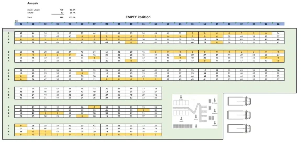
Empty bins. A bird's-eye view of all empty bin locations in the warehouse, where yellow represents zero inventory. The moment you can see your empty positions on a layout — instead of reading them off a list — putaway and replenishment conversations get easier.
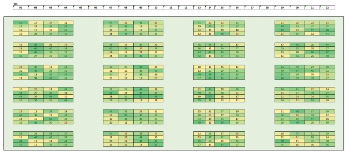
Velocity. A floor plan coloured by pick frequency, where darker colours show locations picked more often. If your hot zones are at the back of the building, you have a slotting problem that will cost you labour every day until it is fixed.
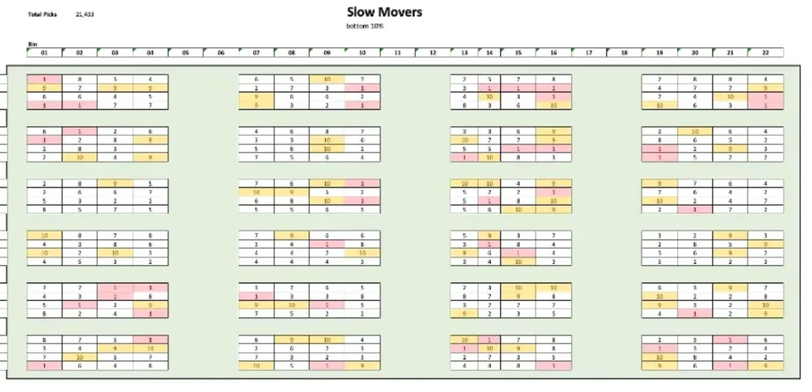
Slow movers. A visual map showing where slow-moving inventory is stored. Slow movers in prime real estate are the most expensive square feet in the building. A heat map makes that obvious in a way a stock report cannot.
Where this fits in our method
Heat-map visibility is Step 2 of the 3PL Operating System — Map It. It comes after See It (capture every dock photo, BOL, POD via DockSnap) and before Score It (per-client operational scorecards via Client Scorecard). The method only works in order — you cannot map what you cannot see, and you cannot score what you have not mapped.
If you are not sure which step your operation needs most, the 3PL Operating Scorecard takes sixty seconds and tells you which dimension is bleeding worst right now. Eight questions. One named tool to start with.
— Chuck & Steven
Want to know which step matters most for you?
Take the 3PL Operating Scorecard. Eight questions, sixty seconds. We’ll show you which dimension is bleeding worst and which named tool to start with.